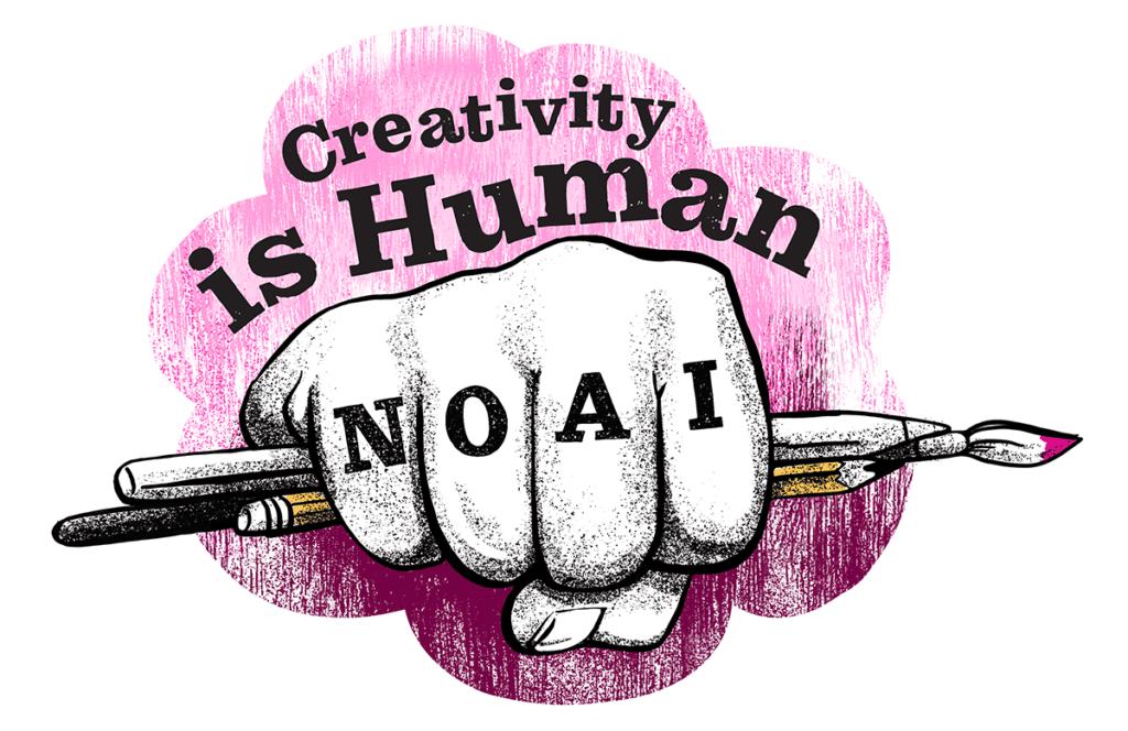

A brand is a living thing. Like a shark, it needs to keep moving to stay vital.
Small businesses, maybe even more than big ones, need to keep fresh. Fresh visuals are an outward sign of the vitality of your business. It shows that your business is quick to evolve with changing times. For a small business this seemingly small thing can sometimes make the difference between getting the gig or not.
So – how often should a brand evolve its visuals? There really is no hard and fast answer to this. However, as a rule of thumb I like to advise clients that a brand should be reviewed about every 5-10 years and consider a tweak or an update or even a full redesign if it makes sense. The trick to keeping your brand recognizable through its evolution is to evaluate what you have, keep what is still relevant and update the rest. In other words, don’t throw out the baby with the bath water.
Swim the swim.
So – as a marketing professional, I need to walk the walk, right? Or swim the swim, as it were. In that effort, in 2020, I announced a new brand for Andiamo Creative, and with it a new website and branded communications. In my design process I began by reviewing the history of the Andiamo brand.

Plumbing the depths
I have updated the logo multiple times since launching Andiamo Design (as it was called then) back in 1997. I wish I could find a visual record of my first business card – I was so proud. The colors I chose were dark bluish-purple and a soft green (the nineties!) I remember I positioned a screened-back, oversized ampersand into the purple background of the card. The font I used was New Baskerville italic. Ah – yes. My lovely ampersand. It has been a part of my brand since day one. (If you’re curious as to why I love the ampersand …)
I only used that brand for a short time. Within a year of launching, I moved house/office, so I needed to update my card. I took the opportunity to rebrand at the same time. For the record, I have unearthed a relic of this second iteration of the Andiamo brand, shown below. Notice the ampersand in use, but small. Color was changed – gone is the blue and replaced with dark terracotta. I kept the green though, and the New Baskerville italicized font, paired with Helvetica Neue extra bold.

Around 2006, in alignment with another home/office move, I revisited my brand again. At this time, I also renamed my company “Andiamo Creative” to reflect the fact that I had begun collaborating regularly with other independent creative professionals to offer clients a fuller range of services. It was the launching of Andiamo as a virtual agency – way back in 2006. This was the point where I started featuring the ampersand, front and center. I also changed the colors again, this time to bold red and golden orange.
The above iteration of the logo lasted a few years until social media began taking hold of small business marketing. A wide logo does not work well as a profile photo – I needed something that fit into a small square and was still legible. So around 2009 or 2010, the below version was born. I also changed the bright red in the palette to more of a dark orange. With time I simplified further and just used the ampersand part of the logo on it’s own as a profile pic. That practice continues today.
2018 marked the 20th year of business for Andiamo. I updated my brand at that time, moving the ampersand into the “o” and adding details commemorating the event. I also changed my font profile from Helvetica Neue to Gotham, and tweaked the colors a little.

After 2018, I removed the flag and tag and below is the most recent version of the Andiamo brand.

Just keep swimming
With the world changing rapidly in 2020, I felt it was time to rebrand again. The world has changed so much, I wanted to create something much different, while still holding on to my favorite part of my brand for continuity – the ampersand.
I have rethought the ampersand mark, using a thinner line, a single color, strategic placement in the round shape including an unexpected bit of white space, resulting a distinctive stand-alone mark. I chose a new palette – a so-pink-it’s-almost-red color paired with black – as a fresh alternative of the reds and golds I’ve been using for so many years. Finally, I introduced a new font, Museo Slab 100 with slimmer lines, paired with Gotham again but also in a lighter weight. Overall, I think this new mark has a modern, sleek profile, is memorable and distinctive, and carries on with the previous visuals in a new way.
I also introduced a new tagline: Design Is Good. The basic definition of design, is a plan, or something created. Graphic design embodies both of those thoughts. Good design for someone like me is a way of life. I also posit that good design can improve daily experience in a multitude of small ways – from your dependable coffee maker, to your comfy ergonomic work chair to that website that made you smile. Every good feeling, no matter how fleeting, counts for a lot. And that’s good. Thank you to good design.

This mark was used as an additional brand graphic, always in a secondary way. It incorporates my new tagline, “DESIGN IS GOOD”

This is the new brand mark used for social media.
Just like the shark, a brand should evolve with time.
Over time, a small business goes through changes. The world changes around you and you must adapt to stay present, vital, and afloat. A brand mark is the emissary of your business and it should reflect your business as it is today, and hopefully what you will be tomorrow. It’s important to evaluate your brand every few years and ask yourself if that mark still feels fresh. Does it represent your business as it is today? Does it inspire confidence, appeal to your client base, reflect the atmosphere we live in now? If not, you may have day old fish on your hands. And nobody likes that.
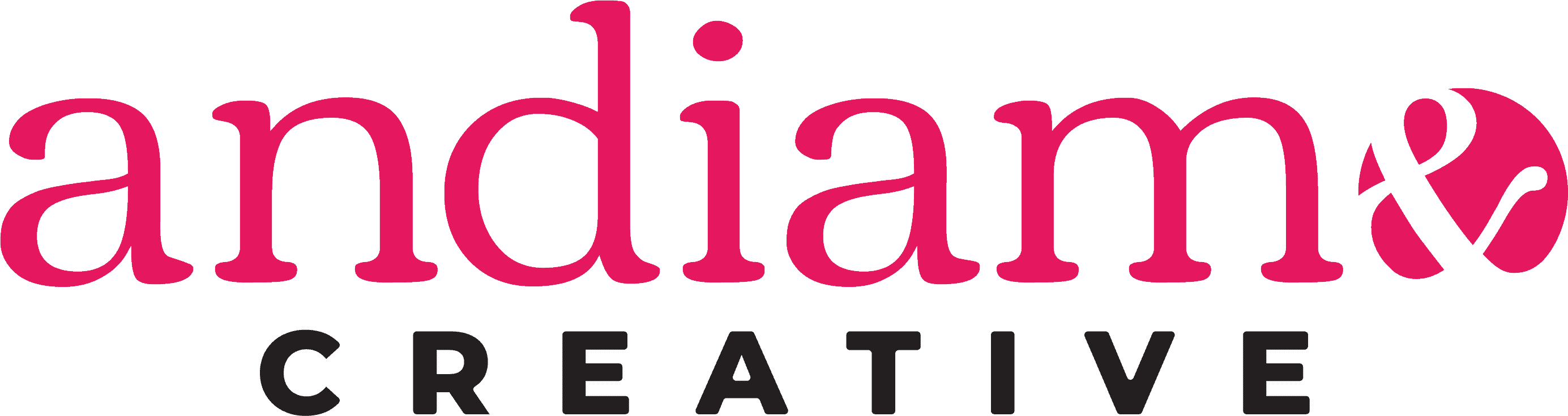
2025: Design is Good, and now it's accessible, too
Five years after this rebrand, Andiamo evolved again — and this time, the catalyst was accessibility.
In 2025, I built my first fully accessible website – the one you’re on right now. It was a learning process in the truest sense: working through WCAG guidelines, rethinking contrast, hierarchy, and navigation from the ground up. As I rebuilt the site, it became clear the brand needed to grow alongside it. A visual identity that was going to live on an accessibility-forward site had to hold its own weight — literally.
The ampersand stays, as it always has. But this iteration is bolder and more graphic. The circle, previously rendered as a slim sans serif font breaking the boundaries of the bright pink sphere, is now a robust serifed font with sinuous curves and a slightly vintage tone.
The wordmark shifts to a heavier serif for “andiamo,” grounded by a tight uppercase “CREATIVE” beneath it. The palette remains the same, but the font provides more presence and confidence. Where the 2020 brand was about streamlining and adapting, this one is about showing up fully.

The new mark doesn’t whisper. It’s designed to communicate clearly — which, when you think about it, is exactly what accessibility is about too.
If you’re thinking your own brand is due for an evolution, let’s talk about what that might look like.