
Updated June 14, 2026
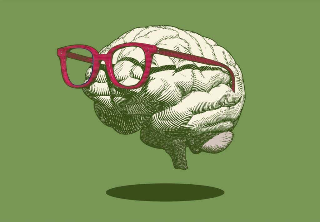
A well-designed logo shouldn’t need to be changed often. If it’s done well, it should serve your company for years — recognizable to your existing clients, memorable to new ones, and solid enough that you’re not cringing every time you hand someone a business card.
But not every logo was done well the first time. And some that were fine a decade ago have quietly become a liability.
How do you know if it’s time?
Here are a few signs your logo — and by extension your brand — is overdue for a professional review.
Your logo could have been made by anyone. Did you put it together yourself using a font you liked? Did your neighbor’s kid design it back when they were “really into graphic design”? Did someone generate it in Canva or an AI tool in about forty-five seconds? A logo should be distinctive, unique, and professionally crafted for your specific company. If yours could belong to any business in any industry, it’s time for an upgrade.
Your logo doesn’t resize well. If your logo becomes illegible when it’s small, that’s a fundamental design problem. A strong logo needs to work just as well at one inch as it does at ten feet — and at profile picture size on social media, which is a test a lot of logos fail. If yours can’t pass that test, it’s worth addressing sooner rather than later.
Your logo looks like it was made in a different decade. Because it was. If your color palette or typography screams early 2000s, that dates not only your logo but your entire company. First impressions are critical, and a logo that looks fifteen years old sends a message you probably don’t intend to send. When you do update, make timelessness one of your first priorities — you don’t want to be back here again in ten years.
Your brand has evolved but your logo hasn’t. Sometimes the logo itself is fine but it no longer reflects who you are. Your services have changed, your audience has shifted, or you’ve grown into a company that deserves better than what you started with. That’s not failure — that’s progress. It just means it’s time to catch up.
What a good brand identity actually includes
A logo refresh isn’t just about swapping out a mark. A complete brand identity includes a full suite of logo formats, a color palette, typography guidelines, and all the file formats you’ll need for print and digital use. We’ve laid out exactly what that looks like here.
Ready for a brand that works as hard as you do?
If any of the above sounds familiar, it’s probably time for a conversation. Let’s talk about what a refreshed brand identity could look like for your business. And if your print materials need to follow suit, we can handle that too.