
Spatial sensitivity: the most overlooked quality in design
There is a quality I have noticed in really great design, and it is not what gets discussed in portfolio critiques or covered in design courses. It is not an eye for color or typographic knowledge, though they matter. It is something harder to name and, I think, harder to teach. It is a sensitivity to space. I am not talking about knowing the rule of thirds or memorizing the principle that elements need room to breathe. I mean something more involuntary than that. More physical, almost. The way a musician with perfect pitch does not decide to hear a note as flat, they simply hear it. Flat. Immediately. Without effort.
My husband is a musician. I watch him develop new tunes and beats, and the process looks from the outside like instinct, like he is not so much composing as uncovering something that was already there, waiting. I think what I do with space is the same thing. A different sense, tuned to a different frequency, but the same kind of knowing.
Outside the studio

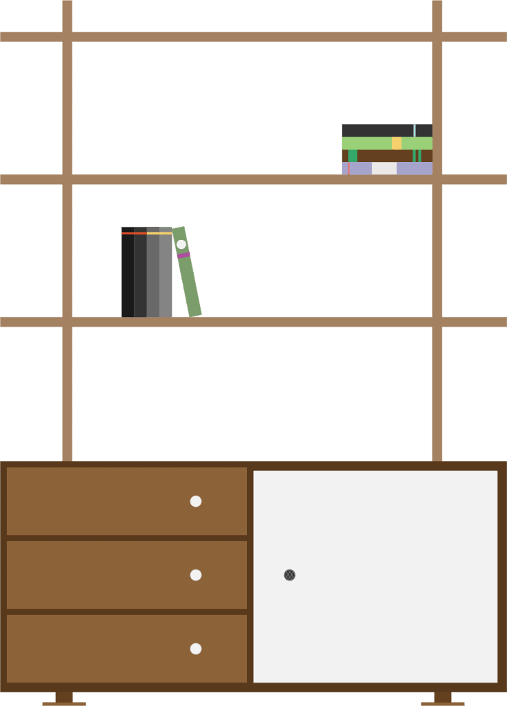
The area rug in my living room is squared to the slats of the hardwood floor. The coffee table is lined up to the exact angle of the L in our sectional. Objects on the tabletop are arranged at angles to each other, but balanced. The hanging lamp sits at precisely the right height above the surface below it. When I use these things and put them back, I line them up the way they belong before I leave the room. I do not think about it. I just do it.
My husband lives his life, as he should. Things move. And when I walk back in, I notice. Immediately. Not because I am looking for it. Because the wrongness announces itself before I even process what I am seeing. He hears things others miss. I see things others miss. And I always notice when the coffee table is at the wrong angle.
That is not a habit I developed. It is a sensitivity I have always had. Twenty-plus years of design work has certainly refined it, but the root was already there.
In every creative discipline
The same instinct expresses itself across every kind of visual and creative work I do, and it always comes back to the same thing: the space between and around things matters as much as the things themselves.
In my pattern design practice, this shows up in the spaces between motifs. A repeat pattern is not just about the elements. It is about what lives in the negative space, how the gaps distribute across the surface, whether the breathing room feels even or anxious or musical. Get it right and the pattern has life. Get it wrong by a fraction and something nags at you and you cannot stop seeing it. It shows up in drawing too.

Inherent or learned?
What I find myself thinking is that this sensitivity, this automatic, almost reflexive awareness of spatial relationships, might be one of the true differentiators between designers who are technically skilled and designers who make work that feels inevitable. That feels right, even when the viewer could not tell you why.
You can teach someone to kern type correctly. You can explain optical alignment and show why mathematical centering is not the same as visual centering. You can demonstrate the difference between a layout that is crowded and one that is airy. But the person who already feels it when something is off before they measure it, before they zoom in, before they hold a ruler to the screen? That person has something that is genuinely hard to acquire.
I think it comes from a lifetime of noticing. Of living in the world with antennae tuned to spatial relationships. Of being the person who straightens the picture frame in someone else’s hallway, not to be rude, but because the tilt was loud.
If you recognize yourself in this, you are probably a designer already, even if no one has told you so yet. And if you are a designer who does not quite feel this yet, the path is not a tutorial. It is attention. It is living more slowly in space. It is noticing the distance between things, in rooms, on pages, everywhere, until noticing becomes automatic. Until the wrongness announces itself before you even go looking.
Andiamo Creative is a graphic design studio. Rochelle Carr also runs a pattern design studio. If you are looking for a designer who notices everything, especially the space between things, you are in the right place.