Branding so good, people want to take it home.
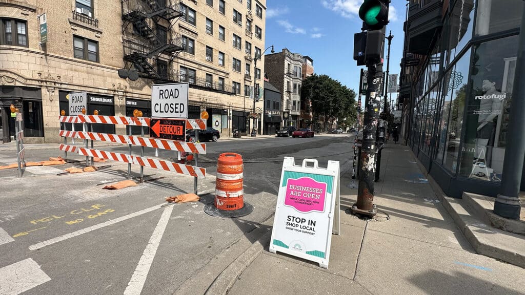
Recently, a client told me something that was shocking and flattering at the same time. A series of pedestal wayfinding signs we created keep getting vandalized. I designed the maps, along with their logo which is affixed to the top of the sign — laser-cut from metal and mounted like a little crown above the sign face. It keeps getting stolen right off the pedestal. Not defaced. Not knocked over. Specifically, the logo keeps getting pried off and taken. Apparently it’s a thing.
It’s a genuinely frustrating thing for my client to have to deal with, so I’m not going to name the client so as to avoid giving anyone any ideas.
But nobody steals something they don’t care about. More than one somebody out there liked that little piece of design enough to risk getting caught prying it off a public sidewalk fixture just to have it for themselves.
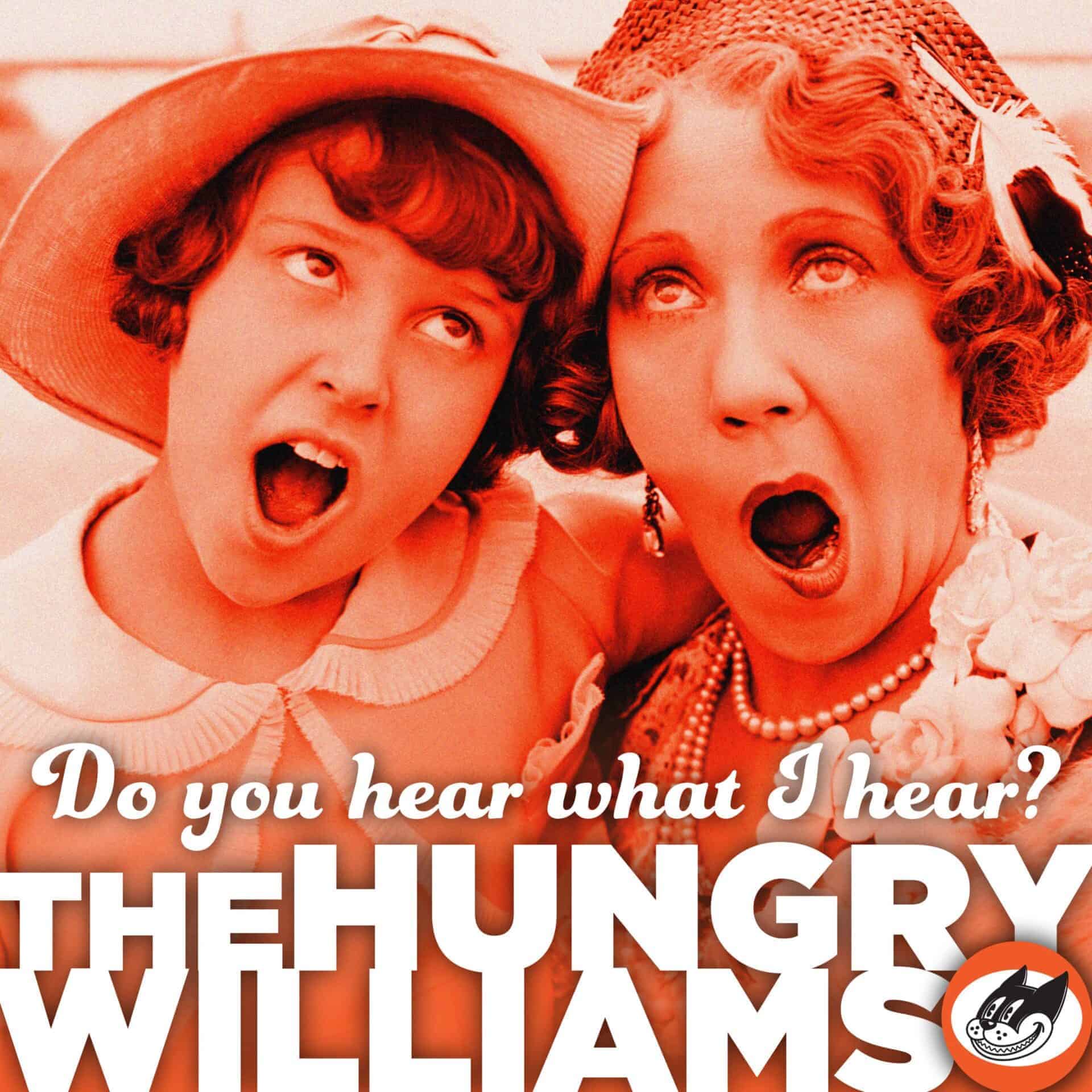
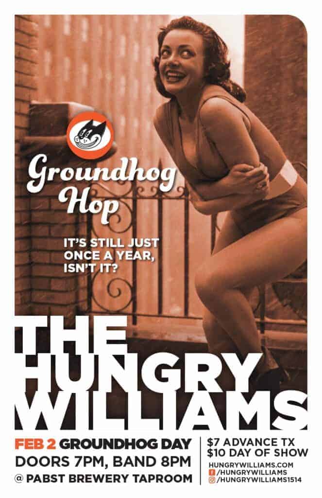
This also brings to mind a second version of the same thing, from a completely different corner of my design work. I design all the branding and promo materials for my husband’s swing band, The Hungry Williams, a Milwaukee group that plays early to mid-century, New Orleans-style jump blues. The visual identity I created for them leans into the era the music comes from: vintage photography, a warm sepia palette, and period slang paired with old-school imagery, all built around a mascot logo — Reginald the Cat, mid-jump, mid-swing. The copy carries its own wit too, playful and a little tongue-in-cheek, written like a period ad trying to talk you into a night out. It’s a strong enough look and voice together that the posters don’t read as generic gig flyers; they read as artifacts from a decade that never actually had this band in it. At the end of a show, fans are known to pull the posters off the wall — and sometimes even ask the band to sign them. They ask for signatures on the posters because they had a great night and want something to remember it by. But the brand design is what catches their eye, gives them the idea to take down the poster in the first place. It’s what makes that impulse make sense. A poster that started as a flyer to get people in the door ends the night as a keepsake, tucked under someone’s arm on the way to the car.
One of these stories starts with someone taking something they weren’t supposed to. The other starts with someone pulling a poster that is past its use-by date and asking for signatures. But underneath, they’re the same signal: the design stopped being informational and started being personal.



What “taken” and “kept” have in common
Most design is functional by default. A wayfinding sign tells you where to go. A gig poster tells you a band is playing on a certain night at a certain place. Once that job is done, the object itself usually has no reason to exist anymore — the sign stays bolted to its post because it’s useful, and the poster gets recycled once the show’s over, because its purpose expired the moment the doors opened.
Every so often, though, a piece of design does its job and then keeps doing something else on top of it. It becomes evidence that you were there. It becomes a small piece of an experience someone doesn’t want to let go of. That’s a different kind of success than “the sign was legible” or “the poster got people to show up” — and it’s a much harder one to plan for, because you can’t put “make people want to steal this” or “make people ask you to sign this” on a creative brief.
What you can do is notice what tends to produce that reaction, and it’s rarely the most polished or most expected choice. That logo isn’t a generic finial — it’s a distinctive mark, recognizable even pried off and out of context. The gig posters that get stolen are imbued with the band’s personality and style. In both cases, the thing people wanted to keep was the part that couldn’t have come from just anyone.
The branding lesson underneath
This is really a branding story more than a signage story or a poster story. A brand, at its best, isn’t just an identifier — it’s a stand-in for the feeling of the thing it represents. People don’t ask a band to sign a poster because they want a piece of paper. They want a physical reminder of a night they liked being part of. Someone doesn’t pry a decorative element off a public sign because they need it — they want a piece of something they responded to.
It’s worth remembering, too, that in an era where it’s easier than ever to generate a passable logo or a decent-looking graphic in seconds, “serviceable” and “worth stealing” are not the same bar. AI tools are good at producing something serviceable — legible, on-brand-ish, technically finished — but that’s not the same as memorable. It’s forgettable because there’s nothing in it that inspires feeling. And it’s the feeling that makes you want to take it home with you.
A logo, a color, a pattern, a shape — the parts of an identity that get dismissed as decoration are often exactly the parts doing the emotional work. That work tends to come from a specific choice a person made on purpose, not generated by an algorithm averaging everything that’s come before it.
Nobody keeps a placeholder. Nobody signs a template. If a piece of branding is memorable enough that someone wants to hold onto it after its job is technically done, that’s not a flaw in the plan. That’s the plan working better than expected.