Every great recipe has that one ingredient you’d miss if it were gone. A logo gives a brand its shape. Color and type give it flavor. But illustration? That’s the secret ingredient that makes people ask for the recipe.
Branding and illustration are a matched pair. Depending on the organization, illustration can be integral to a brand identity, giving it a warmth and personality that logos and type alone can’t create.
In 2015, the Lincoln Park Chamber of Commerce hired me to rebrand their organization, and we’ve worked together steadily ever since. The logo I developed for them is an illustration in itself: a graphic interpretation of architect Jeanne Gang’s Bentwood Pavilion in Lincoln Park, where overlapping wooden strips arc into a tunnel people can walk through. In the logo, those strips became wavy, overlapping semi-transparent lines forming an arch over the Chamber’s name in their signature aqua blue. It’s a welcoming symbol that, thanks to the Chamber’s hard work, now appears all over the neighborhood on bike racks, street pole banners and blades, wayfinding pedestals, event posters, and more.
While illustration has been part of their brand from the start, we’ve mostly relied on purchased stock illustration in order to keep budgets in line. I am a fan of stock art. A well-chosen stock illustration can do a lot of heavy lifting, and each purchase helps support an independent artist. Lately, though, our relationship has grown. The Chamber has launched projects where custom illustration is key to their success. Their new Citibins are a perfect example.
Citibins are the sturdy trash bins you may have passed on commercial streets around Chicago. The Chamber wanted bins that did more than hold trash – they wanted them to add something to the street. Because I’d built their brand from the ground up, I knew their palette, their voice, and their neighborhood before I drew a single line. The illustrations felt like Lincoln Park from the very first sketch.
Four flavors, one recipe.
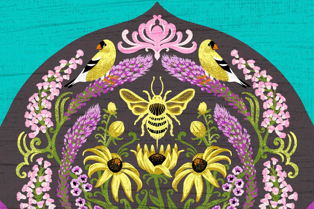
Each bin carries its own illustration, but all four share a common structure. A dark arched frame holds a dense, symmetrical botanical scene. Rippling stripes flow along the base. And the Chamber’s signature aqua wraps around every panel, so the bins read as a set as you move down the street.
The style draws from the Arts & Crafts movement, with its stylized natural forms, layered patterning, and love of handmade detail. The subjects come straight from our own region: native wildflowers, plus the birds, bees, and butterflies that depend on them. Every plant and creature was chosen because it belongs here.

Buttercup
Golden songbirds perch among white blooms, buttercups, and tiny scattered blossoms, set against deep navy with warm orange accents.

Black-Eyed Susan
A bumblebee sits at the heart of this one, framed by black-eyed Susans, purple spikes, and a pair of goldfinches.

Poppy
Red poppies bloom at the center, surrounded by coral flower clusters and small blue butterflies, with pink and teal stripes rippling at the base.

Coneflower
Pink coneflowers rise through clouds of tiny white flowers, with swallowtail butterflies at the edges and curling teal leaves below.
Served up street-side.
We usually think of branding as logos, websites, and printed pieces. But for a chamber or a special service area, the street itself is part of the brand. It’s the first thing visitors and residents experience, long before they visit a website.
Thoughtful details like these tell people a neighborhood is looked after. They invite people to slow down, look around, and stay a while. For the businesses along Clark Street and Lincoln Avenue, that’s the whole point and a particularly charming part of what the Chamber gives back to its membership.
Ready to cook something up?
If your brand feels like it’s missing a little something, it might just be illustration. Trash bins, banners, storefront windows: I’ve yet to meet a surface I didn’t want to draw on.