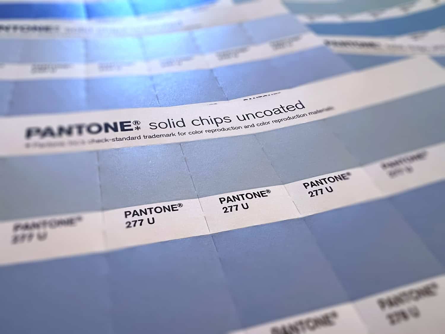
Early in my career, I worked with a marketing director who, after our presentation, casually banned light blue. Not “light blue doesn’t test well with our audience.” Not “light blue is already owned by three competitors.” She just didn’t like it. Personally. As a color. The way you might not like cilantro.
So we edited the work — light blue out, forever, no explanation required. That was a personal bias, applied to every file that crossed her desk from then on, with full authority.
I have thought about this often throughout the years, mostly because it’s something that happens frequently, and shouldn’t. What went through her head as the lead decision-maker for that brand was “I don’t like light blue.” It should have been: “Does light blue enhance the brand?”
It’s not better. It’s just different. I say it all the time — because that question is the whole ballgame, and it’s usually the one nobody stops to ask.
The tell is that it can’t explain itself
Here’s the thing about a real design problem: you can interrogate it. Ask why the logo isn’t working and you get an answer — it disappears at small sizes, it reads as the wrong industry, it looks like the competitor three doors down. Ask why light blue is banned and, in this case, you’d have gotten a shrug and a look that suggested the question itself was a little unhinged. That’s the tell. Even cilantro haters have a defense — there’s an actual gene tied to that soapy taste. A distaste for light blue is not connected to DNA, and a preference that can’t explain itself in terms of the audience, the outcome, or the money has no relevance.
Feelings are wildly inconsistent. The same room that will veto a color purely on vibes will also, an hour later, approve a headline nobody read closely because it was time for lunch. Human judgment in a creative review is not a stable instrument. By nature mercurial, it’s the last thing that should be used to influence a measurable result.
The boss who wasn’t in the room
A close cousin of the light blue problem: the decision-maker who sits out the entire process and shows up at the very end to veto it. Everyone else has been in the workshops, reviewed the concepts, built consensus round by round — and then it goes up the chain to someone who saw none of that and has the power to kill it on a whim. Not because it fails the brief. Because they’re the boss, and this is the first moment they’ve had to exercise that fact.
It reads as a power play because, functionally, it is one — even if nobody intends it that way. A decision made with zero visibility into the process, at the one point in the timeline where it costs the most to reverse, is rarely a design critique. And the project doesn’t get better for it. It just gets slower. Because at this point, the goal is only about different — we’ve lost track of better.
The committee of thumbprints
Then there’s the opposite failure, which I ran into with a large volunteer nonprofit board full of retired and/or aspiring bureaucrats, and a leader who was not willing to ruffle feathers. With nobody willing to set direction or claim veto rights, everybody got a vote on the new logo. And it turned out almost nobody was voting on whether the logo would work. They were voting on whether it felt like theirs. Too many cooks in the kitchen, and every single one of them wanted their own flavor in the pot — whether or not it belonged there.
I was young and used to presenting to marketing-savvy audiences. Two big presentations came and went with no consensus and a fair bit of infighting. There was no shared standard to build consensus around — just a room full of disparate personalities, each one convinced their opinion carried the same weight as an art director’s. We were getting nowhere fast.
What finally broke it loose wasn’t a better logo. I decided to start presentation three with what actually makes a logo good — legibility, versatility, distinctiveness, longevity. Once the room had a standard to measure against instead of just a feeling to defend, we got approval fast. Turns out a committee will still argue about almost anything, but it’s a lot harder to argue that a logo needs to be less legible. And for me, lesson learned: Know your audience.
Side note: that logo is still on their website today — twenty years later. Either the standard held, or nobody on that board has had the stomach for a presentation four.
“Different”, but dressed up
All three of these are the same failure wearing different outfits. “Different” rarely means different in a way that changes whether the piece sells or lands. It usually means “I’m not feeling it” — whether that’s a director who defines themselves on their pushback, a board member wanting bragging rights, or an executive who just wants the room to remember who’s in charge. None of that is a design requirement. None of it pushes the needle for success of the campaign (although it may push the buttons of your humble neighborhood designer). All of it gets prioritized anyway, because feelings are louder than facts… and they arrive first.
Save yourself some trouble
Before any directed change gets made, there’s one question worth asking out loud: will this improve the outcome? Will it help sell the product, land the message, get remembered by someone who has zero feelings about light blue? If yes, wonderful — let’s make the change and I’ll build the rationale into the file notes. If the honest answer is “no, I just don’t like it”, then let’s label it correctly. That’s what you call a personal preference, not a project requirement, and personal preferences should be the last thing to derail a deliverable.
Data gets to override a design; an unfavored color does not. Neither does a boss who skipped the process, or a board member chasing a byline. However sincerely felt, however confidently delivered across a conference table, one person’s preference is still irrelevant to the success of the project.
Somewhere out there, light blue is still banned in at least one brand guide, for reasons no one currently at that company could tell you. The lesson is to make sure you ask before a whim becomes policy. And pass the cilantro — some of us actually like it.