
In a world of infographics
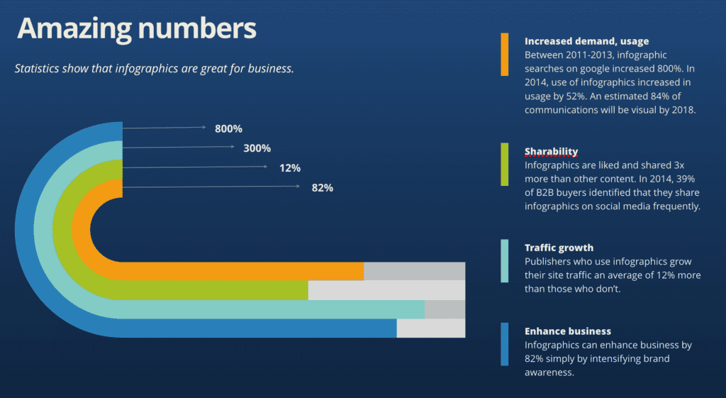
Infographics is a relatively new word. It’s used to describe visuals that combine data and images to illustrate a complicated idea. The intent is to make complex data easy to understand by turning it into a visual presentation. You’ll have noticed them in use everywhere, but most prevalently in data-heavy news shows and articles, research documents, […]
Changing WordPress themes? No sweat.
In general, you should consider a redesign of your website every 3-5 years. Web development trends and best practices change quickly and not only does an old fashioned site do your brand a disservice, a site that utilizes old software can be a security liability as well. However, a new website can be a big spend for a small to midsize business. It’s important to keep your marketing fresh but if I can find ways to help my clients mitigate costs, I’m always up for that.
Top 5 ways to be self-employed AND productive
Number one thing people ask when I tell them I’m self-employed and I work from home: “How do you do that? I’d never get anything done!” Well – first of all if I didn’t get anything done, my self-employment gig would have died a quick death many years ago. Instead I’m in my 19th year of self-employment. […]
Focus on focal point
After many years of working as a professional designer and illustrator, I tend to focus on design all around me. When I notice a great design it’s usually because it has a strong focal point, and you can tell right away this designer knows what they’re doing. Whether it’s a minimalistic layout or a busy […]
5 great things about MailChimp’s RSS emails
For a gal who’s been designing websites and html email campaigns for a really long time, I have a confession to make. I only just realized how cool RSS can be. Ok – I know what RSS feeds are for, and the different ways people use them – but I personally have not made use of an […]
Pop goes the art
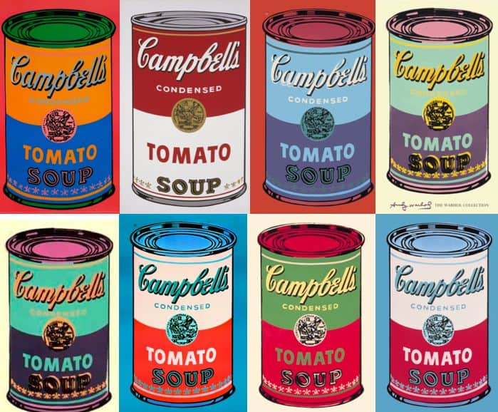
With the sad news that iconic pop artist James Rosenquist passed this week, it got me thinking about the overlap of art and design, and how that has affected my work. Prior to Rosenquist and his contemporaries – Andy Warhol, Jasper Johns, Roy Lichtenstein and others of the era – the art created for advertising was very separate from […]
The casual typographer
The vernacular long ago dictated “email” over e-mail and “internet” over Internet, and today the rules have finally caught up. High time, y’all.
Your face is Irish
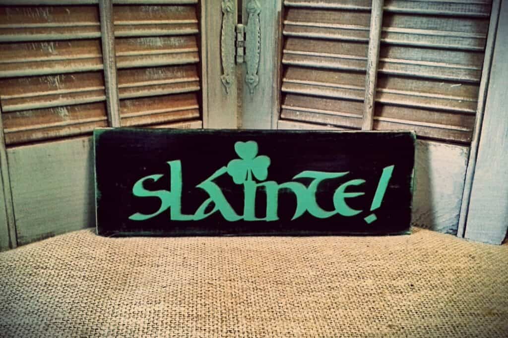
Ever wonder where the beautifully styled Irish type faces came from? You see these fonts often used on signage for Irish pubs and shops, on throw pillows embroidered with charming Irish sayings, and on pretty much anything marketed as Irish or to those who romanticize the Irish. Lyrical and calligraphic, and reads instantly as nothing but Irish. […]
Ode to the Ampersand
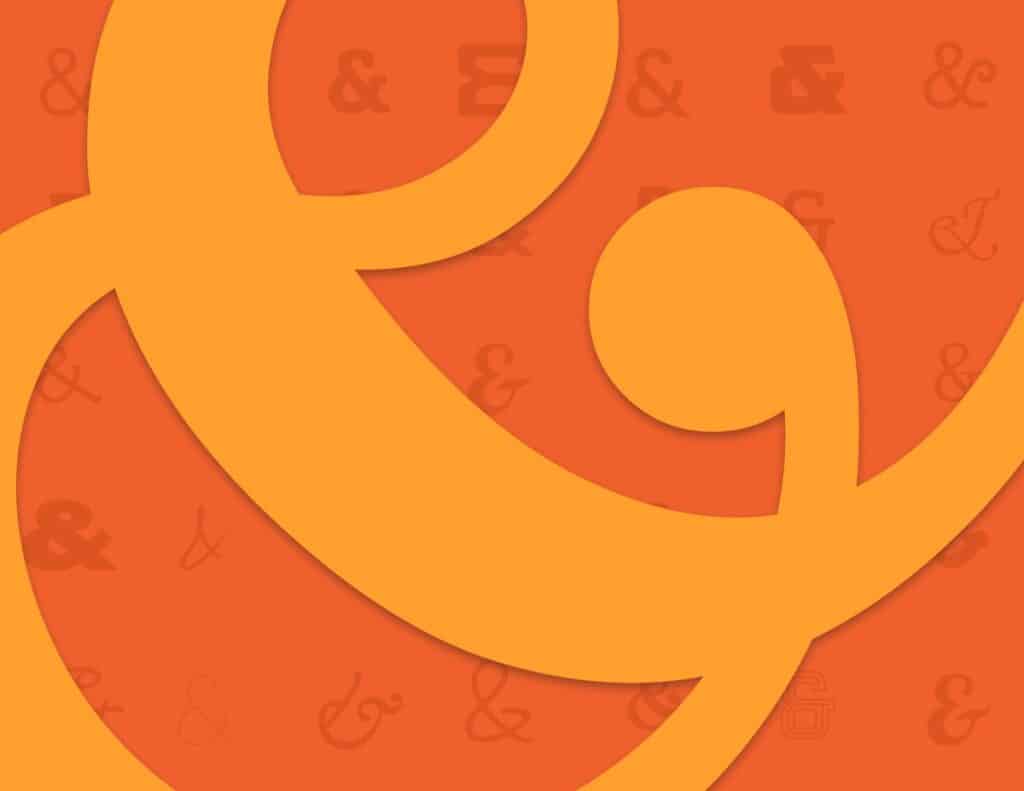
The ampersand. The central graphic in the Andiamo Creative logo, it is a favorite mark for a typography geek like me. Originally formed by a ligature of the latin word ‘et’ which means ‘and’, it is a combination of the letters E and T. This can still be seen in some versions of the mark, depending on the font you are using:
So I finally have a new website

Well friends, it may have taken me a long time, but I finally launched a new website for Andiamo. Phew. I always counsel my clients that to stay relevant, you should update your website every 3-5 years – erring on the shorter side if you’re in a visual field. Well, like most business owners, I had fallen […]