Yeah, so. That’s the paper.
Pantone has announced its 2026 Color of the Year, and the winner is … well … white.
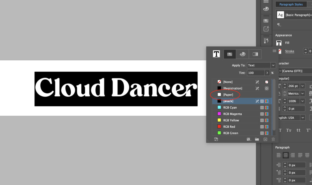
They’ve named it Cloud Dancer, unveiling it with a woman dressed head-to-toe in white, floating in an easy, breezy cloudscape. I get the intention, it’s all about mood. For digital design, fashion, or interiors, white on white is timeless and effortless. But in print? That’s where things get funny.
In the world of CMYK, where full-color runs have never been more affordable, no one is spec’ing white ink. It’s not a trend. It’s not a choice. It’s just… the paper. Ask a print shop for white ink and you’ll earn a gentle, empathetic blink from your Gen Z print rep, followed by a kind explanation that white simply isn’t a thing they print.
So yes: Cloud Dancer is soft, serene, peaceful, and for print designers, delightfully low-effort.


Thanks for nothing (and I mean that kindly).
Here’s the upside: celebrating Cloud Dancer requires zero extra ink, zero spot colors, and zero budget approvals. Honestly? It might be the most print-friendly Color of the Year ever, because the perfect execution involves sending absolutely nothing to press.
Thank you, Pantone. Finally, a color that lets us all take a breath. And take the afternoon off.