Updated June 14, 2026
After all the years I’ve been working as a graphic designer, I see clients making the same mistakes over and over when developing a logo for their company.
Let me name a few of the big ones.
Including “Inc” or “LLC” or “.com” in the logo design
Have a look at Coca-Cola. Do they have “Inc” in the logo design? They don’t — because it doesn’t belong there. Inc is part of the legal name of your company, to be used in contracts and legal documents. Including it in the logo design is unnecessary. Leave it off and look more professional. With logos, simpler is always better. (Curious about the LLC question specifically? We’ve covered that too.)
Designing your logo yourself
Even if you have a talent for drawing, there is a lot more that goes into logo design than just being able to draw. And in 2026, the temptation has expanded well beyond pencil and paper — Canva, online logo generators, and AI tools have made it easier than ever to think you don’t need a professional. The results are usually generic at best, and at worst come with real problems: unclear file formats, no scalability, and murky ownership questions around AI-generated artwork. The most important thing to learn as a new business owner is to know when to bring in a professional. Save your time and creative energy for what you do best.
Using an AI-generated logo
This deserves its own entry because it’s become that common. AI logo tools can produce something that looks reasonable on a screen in about thirty seconds. The problems show up later — when you try to scale it for a banner, embroider it on a cap, reproduce it in black and white, or register it as a trademark. AI-generated images are typically raster-based, low resolution, and not built for the real-world demands of a professional brand identity. Beyond the technical issues, there are unresolved legal questions around ownership of AI-generated work that could create complications down the road. A logo is a long-term investment. It deserves more than thirty seconds.
The company name is too long and complicated
When coming up with a name for your new company, keep in mind that shorter is almost always better. It will be more memorable and will make for a more distinctive logo. Is it called McDonald’s or is it called McDonald’s Fast Food Restaurant? Save the descriptives for your tagline and choose a name that invokes a feeling and an image.
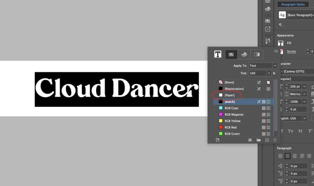
Trying to make your logo into a brochure
Not everything needs to be said in the logo — just your most important point. Your logo needs to be simple, distinctive, and memorable. Too much detail and your message is lost. Keep it concise.
No focus
As a designer I value input from my clients to help me understand their business, their likes and dislikes, and especially what distinguishes their company from others. That information is what leads to a logo that really defines the company. If you can’t tell me those basic things, you need to do some serious thinking before hiring a designer. If your message is unclear even to you, the designer has no chance of creating a strong and clear one for your logo.
Photo in the logo
A good logo is simple and easily replicated in all mediums. Can you think of a single well-known corporate logo that includes a photo? There aren’t any — because a photo is not practical. Your logo needs to be the most versatile piece of your entire marketing toolkit.
Not thinking through all your usages before you start
This is where a lot of otherwise solid logos fall apart in the real world. Before your designer begins, think hard about everywhere your logo needs to live — and that list is longer than you might expect. Print collateral, signage, your website header, email signatures, promotional items, embroidery, vehicle wraps, trade show banners. And then there’s social media, which introduces a whole new set of demands: profile images are small and square, cover photos are wide and horizontal, and a logo that works beautifully on a business card can become an unreadable blob at profile picture size.
A well-built logo anticipates all of these scenarios from the start. That’s why a complete brand asset package includes multiple mark formats — not just one logo trying to do everything.
In closing
There are lots of ways to go wrong with a logo — but most of the mistakes are avoidable with the right guidance from the start. You know a good logo when you see one because it makes an impression, works everywhere, and stands the test of time. If you don’t feel confident about yours, chances are there’s room for improvement. Let’s talk about what that might look like.