
Updated June 14, 2026
I have heard that the test of a good chef can be based on how well they can cook an egg. Simple premise, high standards. In the design world, the equivalent test is the ability to create a great logo. It sounds straightforward. It isn’t.
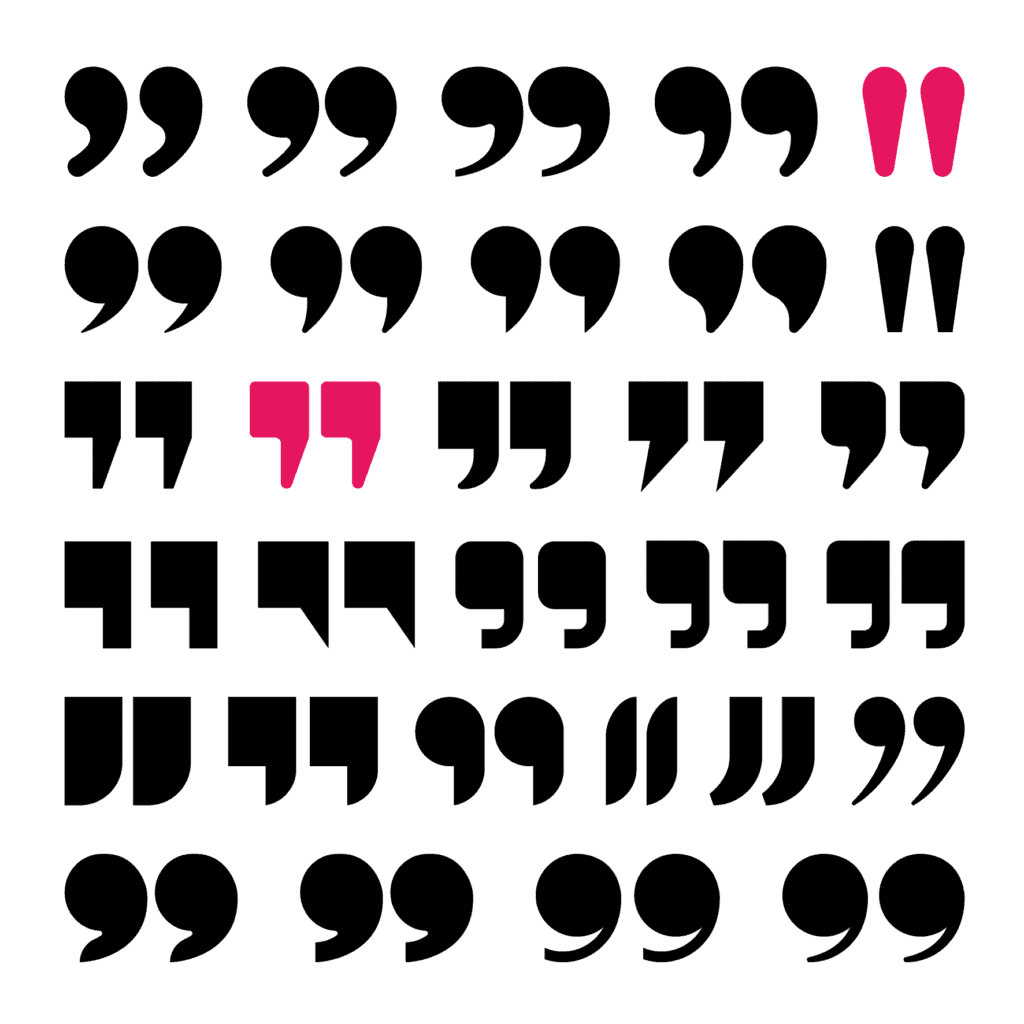
If you’ve worked with a professional graphic designer to develop a logo, you may have noticed they always start with black and white. There are two very practical reasons for this — and both of them tell you something important about what makes a logo work.
Why designers always start in black and white
Reason 1: Versatility
Your logo is going to go everywhere. Business cards, letterhead, your website, signage, brochures, embroidered caps, silk-screened t-shirts for the company softball team, trade show banners, social media profile images — that tiny square that has to be instantly recognizable at the size of a thumbnail. Every single one of those applications has different requirements, and your logo has to hold up across all of them.
That’s a lot to ask of a single mark. And it’s exactly why a logo that only works in color, or that has too much fine detail, or that falls apart at small sizes, is not actually a good logo — no matter how much you love it at full size on a white background.
Working in black and white from the start forces the design to earn its keep on the strength of the mark itself — the shape, the form, the concept — before color enters the picture. If it works in black and white, it will work everywhere. If it doesn’t, no amount of color will save it.
Reason 2: Color is emotional
Color is powerful — which is exactly why it can’t be part of the early conversation. Color automatically incites emotion, and that emotion can seriously interfere with your ability to evaluate a design objectively. You’d be surprised how much a color can sway your judgment. A strong concept presented in a color you happen to dislike can torpedo a perfectly good logo before it ever gets a fair hearing. And a weak concept in a color you love can sail through approval when it shouldn’t.
By presenting logo concepts in black and white first, a good designer is protecting you from your own color associations — keeping the focus on whether the mark itself is strong, distinctive, and right for your company. Color comes later, once the concept has been approved on its own merits. That’s when the fun begins.
A third reason worth mentioning: accessibility
A logo that doesn’t have sufficient color contrast isn’t just a design problem — it’s an accessibility problem. People with color blindness or low vision need to be able to read and recognize your mark. Starting in black and white builds this thinking in from the beginning, ensuring the logo works for everyone before color decisions are layered on top. It’s one of the seven essential points to a good logo — and one that’s easy to overlook if you skip straight to color.
Now that’s a good egg
If you are working with a professional designer, they won’t make these mistakes. They’ll develop the logo in black and white, move to color only after the concept is approved, and make sure the final mark holds up across every use case your business demands. If you’re not working with a professional — well, now you know what to watch for.
That’s not just a good egg. That’s eggs benedict.