
Updated June 14, 2026
Social media has been with us long enough now that you’d think every brand would have figured this out. And yet — I still see logos squeezed into profile image spaces where they become an unreadable blob, or brand marks that look great on a business card but fall completely apart at thumbnail size. It happens more than it should, and it’s almost always a sign that the brand wasn’t designed with digital platforms in mind from the start.
The small square problem
The profile image is the toughest test a logo faces. Whether it’s a circle on Instagram, a square on Facebook, or a rounded square on LinkedIn, the space is tiny and unforgiving. A full logo with a tagline, fine detail, or multiple elements simply cannot survive at that size. What reads beautifully on a letterhead becomes an indistinguishable smudge on a social profile.
This is why a complete brand identity now requires a dedicated icon — typically the brand symbol or a simplified version of the mark, stripped of any tagline or supporting text, designed specifically to hold up in a small, often circular space. It also doubles as your website favicon, which presents the same challenge at an even smaller scale.
Beyond the profile image
Social media is just the most obvious example of where this plays out. The same logic applies across the full range of digital touchpoints a modern business uses:
- Email marketing — your logo appears in the email header, often on a colored or dark background, and needs to be legible at whatever width the recipient’s email client renders it. A white or reversed version of your mark is essential here.
- Digital advertising — banner ads, social ads, and sponsored content come in a dizzying array of sizes and aspect ratios. Your brand mark needs to work across all of them without requiring a custom redesign every time.
- Cover images and headers — Facebook, LinkedIn, and YouTube all use wide horizontal banner spaces that are completely different in proportion from a profile image. A horizontal or inline version of your logo serves this space far better than a stacked mark that gets lost in the width.
- Email signatures — a small, clean version of your logo here reinforces your brand on every communication you send. It needs to be optimized for screen display and small enough not to dominate the signature block.
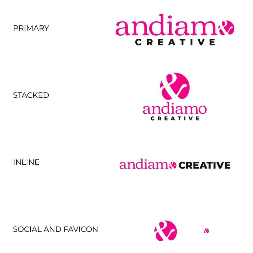
The asset library
The answer to all of this is a well-planned brand asset library — a suite of marks designed from the start to work across every context your brand will appear in. At minimum that includes a primary mark, a horizontal or inline version, and a brand icon for small spaces and favicons. Each of those in a full set of color profiles — full color, black and white, reversed, and white versions — for both digital and print use.
The image below shows how this works in practice using the Andiamo Creative brand as an example.
A brand that’s built this way doesn’t have to improvise every time a new platform or format comes along. The toolkit is already there. Here’s a deeper look at what a complete brand asset package includes.