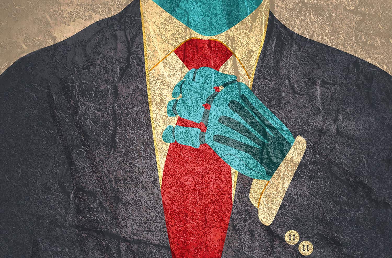
I can spot an AI-generated design from across the room now. So can most designers I know. It’s not a superpower — it’s pattern recognition, the same skill that lets a chef taste a sauce and name three ingredients you missed. I look at graphics all day, every day. I’m trained to notice.
But here’s what’s interesting: the pattern I’m noticing isn’t really about AI being a bad designer. It’s that AI, right now, seems to have exactly one design philosophy, and it’s applying that philosophy to everything. Open five different brands’ social feeds and you’ll see the same visual accent: glossy gradients, a dozen overlapping elements, images layered on images, filters stacked on filters. Every surface is busy. Every composition is maximal. It’s as if one overworked designer got hired by the entire internet at once, and their whole aesthetic is “more.”
It’s a lot. And I don’t think it’s going to last.
We’ve seen this movie before
Design has a rhythm to it — ornate, then plain, then ornate again. The Victorians piled on filigree until Bauhaus came along and stripped everything down to grids and function. Grunge design in the ’90s buried type under layers of texture until the 2000s rediscovered white space. Every time a style gets pushed to its loudest, most saturated extreme, the market gets tired of it, and the pendulum swings hard the other way.
Mid-century design is probably the clearest example. It arrived after decades of ornamentation and said: less. Clean lines. Honest materials. Negative space treated like a design element in its own right, not empty space waiting to be filled. A chair could just be a chair — you didn’t need to carve a garden into the armrest to prove it mattered.
I think we’re heading toward a version of that moment again, and AI-generated design is going to be the thing that triggers it.
Overkill has a shelf life
Right now, “looks AI-made” and “looks overproduced” are basically the same sentence. Too many elements. Too much depth-of-field blur. Too many gradients doing too little work. It reads as impressive for about five seconds, and then it reads as noise — because the eye can’t rest anywhere. There’s no quiet spot in the composition to land on.
The average person hasn’t consciously clocked this yet. But they will. Recognition always starts with people who are paid to notice — designers, photographers, architects — and it trickles down until everyone can feel that something is “off” even if they can’t articulate why. That’s usually the tell that a style is entering its late, self-parodying phase. When a look becomes instantly identifiable as a category rather than a choice, it’s already halfway to being dated.
What comes next
My guess is the backlash won’t just be a return to minimalism for its own sake — it’ll be a return to minimalism as proof of a human hand. Restraint is hard to fake. Choosing to leave something out takes a decision a machine trained to maximize “impressive” doesn’t naturally make. A single well-placed image says more than twelve overlapping ones. One typeface, used with intention, says more than five effects stacked on top of each other.
So I think the next wave of design that feels fresh is going to look almost defiantly plain by comparison: clean lines, real white space, a point of view instead of a pile of effects. Not because minimalism is inherently superior — trends aren’t about superiority, they’re about contrast — but because after a few years of visual maximalism, quiet is going to feel like relief. And “a person clearly made this, on purpose” is going to become a selling point in itself.
Three creatives who already proved this
If you want to see what “restraint done by a human” actually looks like, these three are a good place to start.
Henri Matisse (1869–1954) Matisse spent the first half of his career as a painter — the founder of Fauvism, known for wild, expressive color — and the second half moving toward radical simplicity. By the 1940s, ill health kept him from painting standing up, so he started cutting shapes directly out of painted paper instead, work that became the Jazz series and pieces like The Snail. It’s some of the most reduced, flattest work of his career, and it’s also considered by many to be his best. Matisse is proof that minimalism isn’t a lack of ambition — it’s often the most refined, hardest-won version of a style, and you can still see the scissor marks. Nothing about it reads as generated.
Saul Bass (1920–1996) is the name most design students learn first. He redefined what a movie title sequence could be — Vertigo, Anatomy of a Murder, The Man with the Golden Arm — using cut-paper silhouettes, a handful of shapes, and one bold color instead of literal imagery. He did the same thing for corporate identity, building marks for AT&T Bell, United Airlines, and Quaker Oats that still hold up decades later. What makes Bass relevant here is that his reduction was never absence — every shape he kept was a decision, and you can feel the editing. That’s the opposite of an AI composition, where more elements get added because nothing stops it from adding them.
Calvin Klein (b. 1942) American fashion in the 1980s was maximalism at full volume — big shoulders, bold logos, glitz for its own sake. Klein’s answer in the ’90s was almost aggressively plain: neutral palettes, unstructured slips, minimal branding, campaigns shot by Herb Ritts and Steven Meisel that let a single clean image do the work twelve accessories would have done a decade earlier. It became “American minimalism,” and it’s the exact pendulum swing this post is predicting — except it already happened once, in a completely different industry, for the exact same reason: people got tired of loud.
I’ll admit a bit of self-interest here. My illustration work tends to run maximalist — but my graphic design instincts have always leaned the other way. I’m not against a frill or a decorative flourish when it earns its place, but “less is more” is the rule I default to, not the exception. If this pendulum really is about to swing back, I don’t have far to go to meet it.
I could be early. I could be wrong about the timeline. But I’ve watched this pendulum swing before, and this particular extreme feels like it’s already peaking.