
Baskerville
Literary and refined.

Garamond
Timeless and bookish.

Futura
Utilitarian and tidy.

Ultra
Practially sculpture.

Abril Fatface
Decorative and feminine.

Bungee
Chunky and funky.

Funkydory
"Et" with flourish.

Confitera Script
The "Et" is clear.

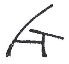
Copperplate
8 and & had a baby.