
Updated June 14, 2026
Most business owners these days recognize the need for a company logo. Your business card, your shop signage, your website, your packaging – all of this is your company branding and good branding starts with a good logo. Many times it’s your first impression and we all know how important that is these days. You may not get the chance to make a second impression.
Not sure where the logo fits in your overall marketing plan? Start here: The logo always comes first.
So… what makes a good logo?
Any seasoned graphic designer can tell you that a really solid logo should hit on all seven of these points:
1. Focused
A logo should focus on the most important point you want to make about your company. There can be secondary messages – sometimes that double meaning is what throws the logo over the edge from good to great. However, the primary message should always be clearly understood.
2. Simple
The concept must be distilled down it’s most simple and clear graphic representation to maintain focus, memorability and functionality.
3. Memorable
It makes an impact. Distinctive and memorable, it leaves the viewer with a clear feeling about your company.
4. Functional
Scalability, color independence, and flexibility are the three pillars here.
- Scalable — works just as well at one inch as it does at ten feet.
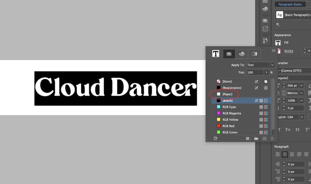
- Not dependent on color — the meaning and clarity hold up equally well in black and white.
- Flexible — equally at home on print collateral, a website, or embroidered on a cap. Photos, gradients, soft drop shadows, and excessive detail are the usual culprits when a logo fails this test.
5. Relevant
Meaningful and appropriate for the company it represents — and not beholden to any trend or era. Dated logos are a liability, so make sure your mark has longevity built in from the start.
6. Unique
It should stand on its own. Distinctively different from competitors, not a variation on a theme.
7. Accessible
Color contrast matters — the mark needs to be legible for people with low vision or color blindness. Font choices count too. Decorative or intricate letterforms can be striking at large sizes but fall apart when small, or for viewers with visual impairments. If it can’t be read by everyone, it’s not as functional as you think.
The same accessibility principles that apply to your logo apply to your website. Here’s a cheat sheet for getting that right too.
One logo is no longer enough
When I first wrote this post, a logo was largely a single design that needed to work in color and in black and white. That’s still true — but the expectation of what a complete brand asset package looks like has evolved considerably.
Today, a well-built brand identity typically includes a suite of marks designed to work across different spaces and uses. Here’s what that looks like in practice:
- Primary mark – Usually a centered or stacked format, with and without tagline
- Secondary mark – Often a horizontal format for spaces where the primary mark doesn’t fit, with and without tagline
- Tertiary mark – A third variation that covers a use case not already addressed by the first two
- Brand icon – Typically the logo symbol without text, sized and proportioned to work as a social media profile image and a favicon
Each of those marks should be delivered in a full suite of color profiles: full color for digital use (RGB), full color for print (CMYK), black and white, reversed (white on dark), and a white-only version for use on colored or photographic backgrounds. And every version should be provided in both vector format (for scalability) and raster format (for digital use).
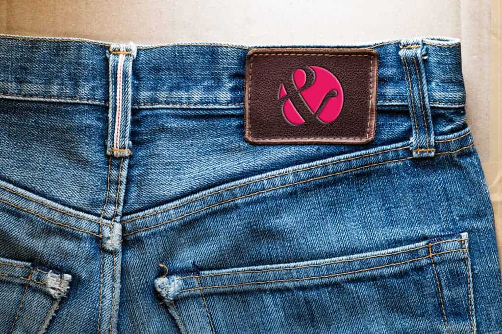
That’s a lot of files — and every single one has a job to do. A complete brand asset package is what ensures your identity holds up wherever your business takes you, from a browser tab to an embroidered golf shirt, to a banner at a trade show.
If you’re ready to build a brand identity that covers all the bases, let’s talk about what that looks like for your business.
Your best foot
Your logo should help you make a great first impression — one that is unique, memorable, and functional across every potential use. If you start with a strong logo, you shouldn’t have to revisit your branding for a long time, if ever. Think of Coca-Cola or Nike — essentially the same marks for decades, with only minor refinements along the way. That kind of longevity doesn’t happen by accident. It happens because the foundation was solid from the start. That’s what you should be aiming for.