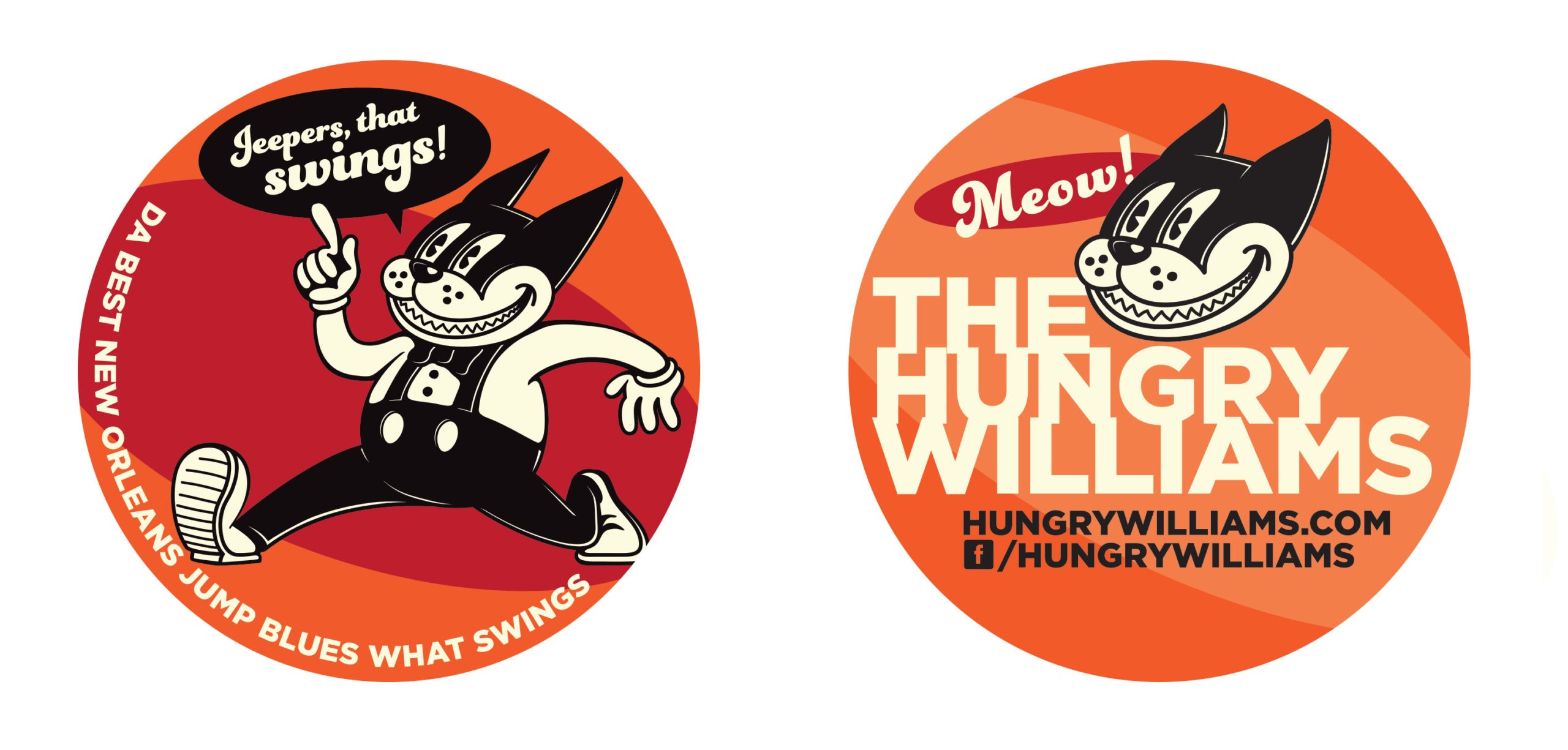
Logo and color palette
A well-designed logo shouldn’t need to be changed often. If it’s done well, it should be a lasting brand for your company that is recognizable to your clients and memorable to your potential clients. However, if you started your company on a shoestring and hired your neighbor’s kid who was good at drawing to design your logo 10 years ago and you haven’t revisited it since, you might do well to invest in an update.
A couple of guidelines to determine if it’s time for an update:
- Your logo can easily be imitated on anyone’s computer. Did you create your logo yourself using Times New Roman (or — gasp — Comic Sans)? Not the best idea. A logo should be distinctive and unique. Time for an upgrade.
- Your logo does not resize well. If when sized to fit a business card, your logo becomes illegible or is so complicated that you lose the meaning when it’s small, then you have a problem. A strong logo needs to work as well at 1 inch high as it does at 10 feet.
- Your logo is dated. If your logo uses a color palette that was popular in 1982, or if it features a font that has gone out of style, that dates not only your logo but your whole company. First impressions are critical and if your company logo looks like it was created 15 years ago, then it’s in the best interest of your company to update now. And to make sure that your new logo does not follow trends, make timelessness one of your first priorities.