 The unveiling
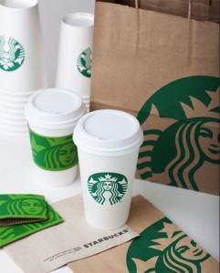
Starbucks is celebrating their 40th anniversary this month and they've begun by unveiling new signage at stores in Beijing, London, Paris, New York and Seattle, and also by starting to use their new logo on packaging and cups in coffee shops around the country. (I hear they are giving away free snacks with each purchase for the next couple days too!)
I'm a fan
I wrote a previous blog on this topic - I am definitely a fan of this redesign. The new logo is sans words - a ballsy move which might be forming a trend with other global brands. Target recently made this move and brands like Apple, Shell, McDonalds and Nike all are instantly recognizable sans words. From this photo it seems the only place where the Starbucks name is actually used is on the napkin. Removing the name was an essential strategic move - Starbucks is no longer just coffee. No words allows the brand to become whatever they want it to be.
As for their packaging, I'm loving the choice to crop the logo on the bag and to pair it with a brighter green on the cardboard cup holders. All in all I think this is a very strong redesign for a revitalized global brand.
I know I want to go out and get a coffee right now... anyone with me?