The ampersand. The central graphic in the Andiamo Creative logo, it is a favorite mark for a typography geek like me. Originally formed by a ligature of the latin word ‘et’ which means ‘and’, it is a combination of the letters E and T. This can still be seen in some versions of the mark, depending on the font you are using:
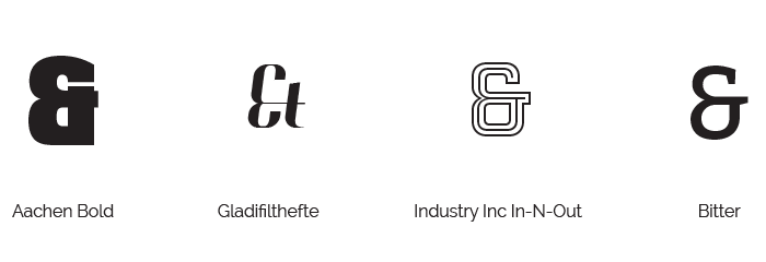
Interested to know more about the origins of this mark and of the word itself, I found the following entry on dictionary.com:
Word Origin and History for ampersand
n. 1837, contraction of and per se and, meaning “(the character) ‘&’ by itself is ‘and’ ” (a hybrid phrase, partly in Latin, partly in English). The symbol is based on the Latin word et “and,” and comes from an old Roman system of shorthand signs (ligatures), attested in Pompeiian graffiti, but not (as sometimes stated) from the Tironian Notes, which was a different form of shorthand, probably invented by Cicero's companion Marcus Tullius Tiro, which used a different symbol, something like a reversed capital gamma, to indicate et.
This Tironian symbol was maintained by some medieval scribes, including Anglo-Saxon chroniclers, who sprinkled their works with a symbol like a numeral 7 to indicate the word and. In old schoolbooks, the ampersand was printed at the end of the alphabet and thus by 1880s had acquired a slang sense of “posterior, rear end, hindquarters.”
What's this got to do with Andiamo Creative?
For Andiamo, the ampersand is indicative of the brand. It was chosen as a logo mark because represents the business model upon which I built Andiamo, and represents the kind of business I run. Andiamo is a small business run by a single person leading a group of professional creative contractors, but we as a group offer all the services of a full sized branding agency. We do the strategy... AND planning... AND the branding.... AND digital.... AND print... AND illustration... AND copywriting... you get the idea. Plus, Andiamo begins with ‘and’! (Even though Andiamo actually means “we go” or “let‘s go” in Italian).
It's more than that though - it's an overall mission statement. The inclusiveness inherent in the word ‘and’ speaks to the fact that we work with our clients to find the design solutions that best fit their needs and vision. We're not after awards and adulation for ourselves, we prefer that our clients win. We welcome all points of view for discussion and debate during the design process. While we come to the table with strong views on design and strategy based on research and experience - we do not dictate to our clients. We prefer discussion, and an organic, inclusive approach.
You & us. Us & you. Andiamo. That's how we roll.


