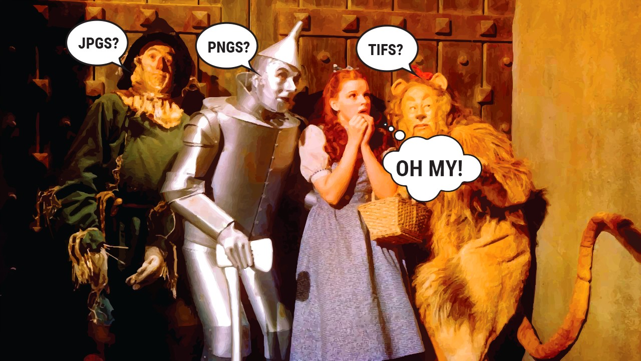
Along my journey in the visual design industry, I've accumulated a list of best practices on handling graphic files. I find that people who do not walk this road every day tend to get confused. JPGS and PNGS and TIFS and EPS files, what to choose? How do you know you're headed down the right path? Auntie Em can't help you here, so here's what Auntie Ro knows.
 Pixel-based formats
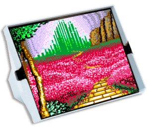
JPGS and PNGS and TIFS, and also GIFS are all pixel-based files. They are comprised of a grid of individual tiny squares of color called pixels. Think of a Lite-Brite™, but much smaller. Digital photos are pixel-based, so it follows that pixel-based file formats are the best way to save your photographic images. Also, digital media such as websites, emails, social media focus on pixel-based files for graphics because monitors display in pixels. Drawbacks to a pixel-based format is that you cannot enlarge these files without losing resolution. Enlarging means the pixels will expand and become fuzzy - not good. Another drawback is that large pixel-based files can become very big files. This is a good reason to be aware of best file formats for saving that reduce the file size without losing fidelity.
- JPG current standard in the industry, great compression (saves small)
- PNG similar to JPG, but you can specify a transparent background (helpful for pixel-based logo files)
- TIF (OR TIFF) used to be the standard in the industry before JPGS came along - still useful but jpgs are smaller so preferred
- GIF this can be useful for making small animations as well as saving logos with transparent backgrounds, and saves smaller than pngs.
Vector-based formats
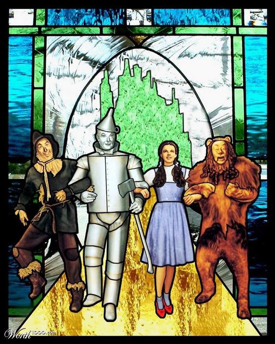
EPS and SVG files are vector-based graphics. This refers to the lines and fills that comprise the file and are usually created in a drawing program like Adobe Illustrator. Think of stained glass - the black outlines represent the vector lines and the colored glass is the fill. One of the big benefits is that the file sizes are small (exception: very complicated illustrations) and you can enlarge them to any size - even a billboard - without losing resolution. Vector format is perfect for logos, digital illustrations and infographics. Drawback - doesn't work well for photos.
- EPS the standard in the industry for logos in print, but not supported for online usage
- SVG a fairly new addition to file format options, and can be used on the web
More tips along the way:
Multiple file formats for logos. Your branding or logo designer should supply your final approved logo design to you in multiple formats including both vector-based eps files, and pixel-based JPG and PNG files. The designer should also supply each of these formats in multiple color profiles - RGB (for digital), CMYK (for print) and you should also get black/white or grayscale and reversed (white letters). These formats and profiles should cover all your uses now and in future, no matter where your business leads you.
Just the files please. When transferring images, logos, graphics from one person to another, a common work flow I've noticed is to first place them in a Word file and then send them. Why is this? There is no need for this extra step. Zip 'em up and send them to me in an email, share a dropbox folder, etc - but Word files are unnecessary and clunky.
Resolution matters. When you're working in print, it's important to have your photos in high resolution - 300dpi at the dimension you want to print. For instance a photo that covers an 8.5 x 11 sheet needs to be 2550 x 3300 pixels in dimension in order to print well. When you're working in digital - an email campaign or website, etc 72 dpi will do the trick (144dpi if you're catering to Retina screens).
Avoid pixel-based EPS files. Yes, you can save a photo out of Photoshop as a pixel-based EPS, but I have never found any practical advantage to this format. Your file size becomes enormous, and for the purposes of print or digital design, I see no benefits to image fidelity or visual impact. Stick with JPGs.
Choosing between JPGS and PNGS and TIFS? Don't be scared - now you know what to do.
For the purposes of what I do - branding, print design, infographics, WordPress websites, email design - this list is more than sufficient. However, it's by far not every brick in the road, so if you want to learn more here are some interesting links: