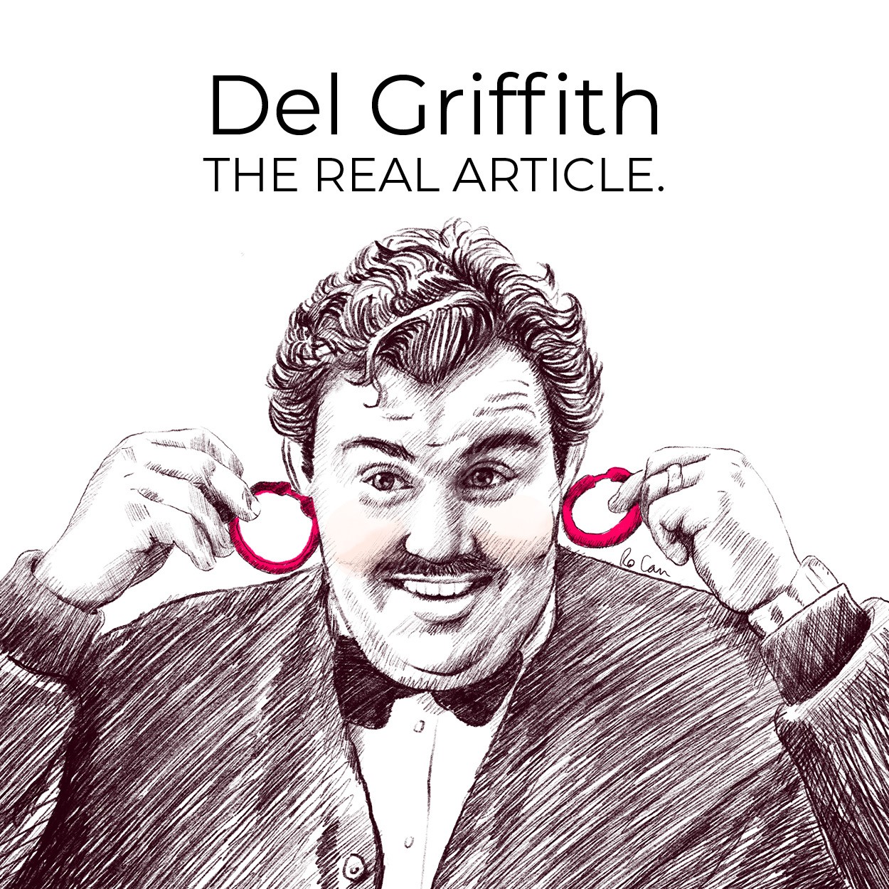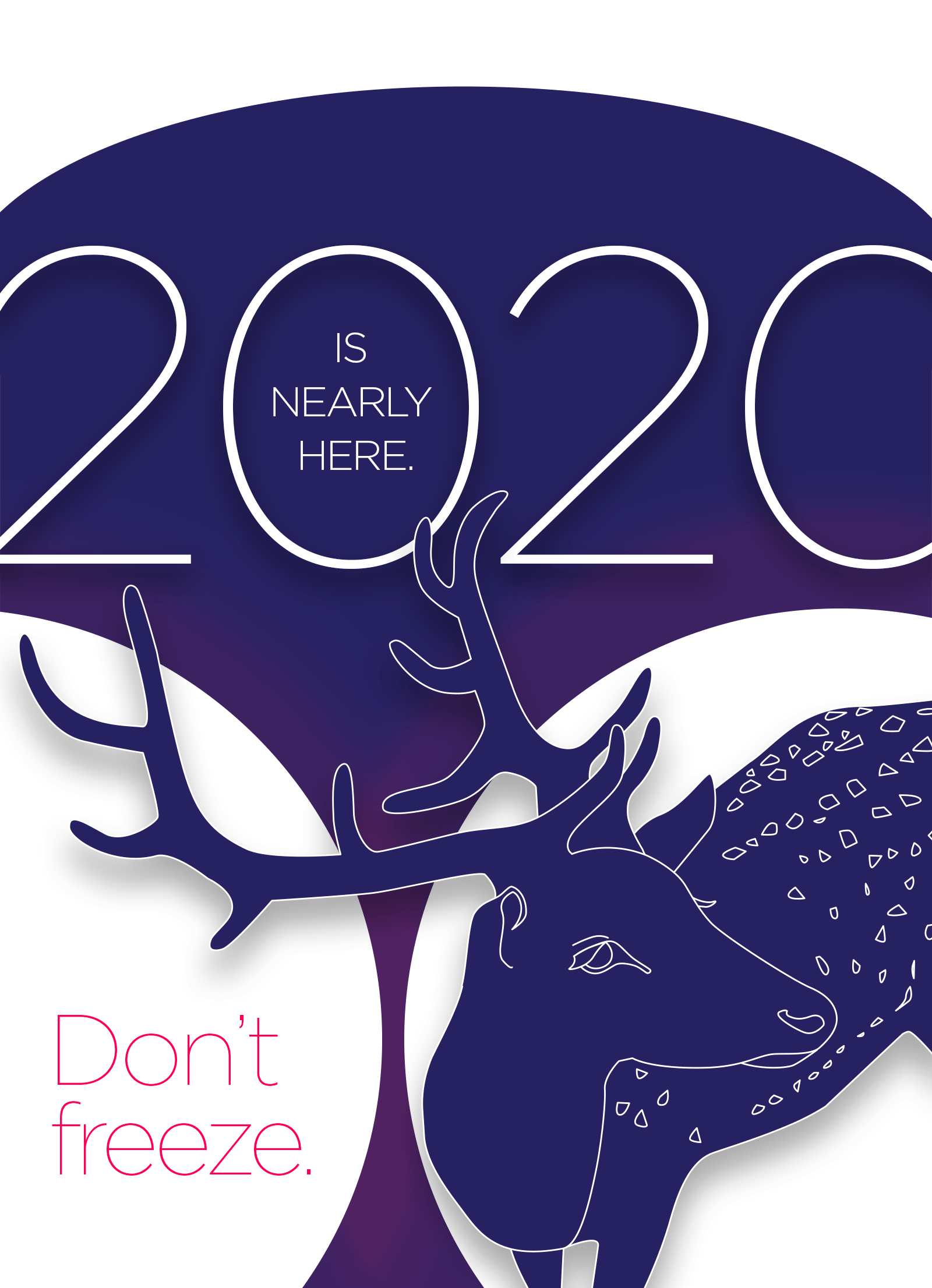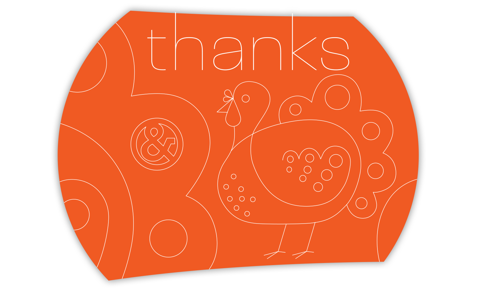
After many years of working as a professional designer and illustrator, I tend to focus on design all around me. When I notice a great design it's usually because it has a strong focal point, and you can tell right away this designer knows what they're doing. Whether it's a minimalistic layout or a busy one, all elements of the design lead the eye to the single area that the designer wants you to notice in particular.
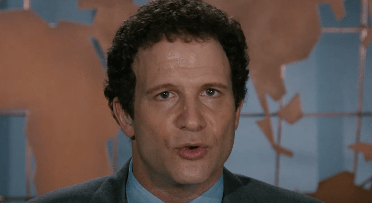
This idea - focusing on a single strong statement and letting the rest support that idea - goes for all sorts of creative endeavors - from creating a brochure, a room, a paragraph, a speech, or even an outfit to wear to dinner. Makes me think of a scene from one of my favorite movies, Broadcast News (1987) featuring Al Brooks and William Hurt. I couldn't find the particular clip, but here's the line from a moment when a veteran news anchor is giving tips for a successful broadcast to another news anchor before his first live broadcast:
Aaron Altman (played by Al Brooks): The pointers were great, I'll study the tape.
Tom Granick (played by William Hurt): Just remember that you're not just reading the news, you're narrating it. Everybody has to sell a little. You're selling them this idea of you, you know, you're sort of saying, trust me I'm, um, credible. So when you feel yourself just reading, stop! Start selling a little.
Apparently, even with this sage advice, things didn't go so well. Even the best advice cannot prevent flop-sweat:
Keeping focal point in mind when you're creating - anything - is about having focus in general. You are "selling" your message within whatever medium you work. If you want your audience to understand you, you need to focus your message. Doing this successfully in design has to do with placement, color, direction, focus, contrast and shape. All basics of the design and composition.
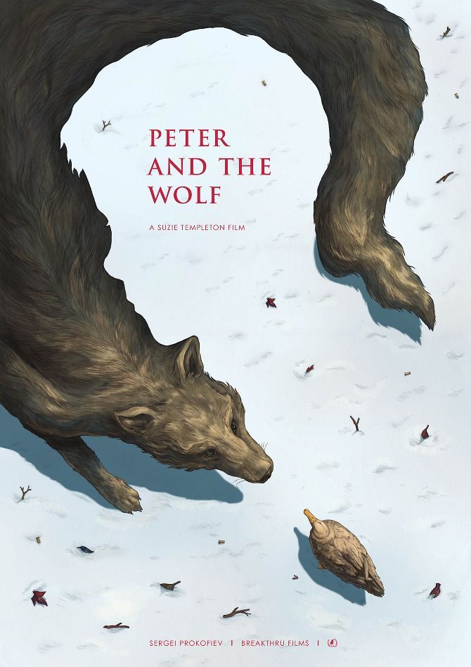 Take the following example I found - an illustrated cover of the story "Peter and the Wolf". The focal point here is the title. Your eye is drawn there first because of the following things:
- Placement - top third of the page, and centered.
- Color - red against a light background
- Direction - the shape of the wolf and the bird direct your eye to the title
- Shape - the negative shape made by the body and tail of the wolf wraps around the words
It's only after a moment that your eye notices that the negative space is also the shape of Peter's head in profile. Brilliant!
This is a beautiful example of employing focal point - every element of the page is a strategic choice, with the goal of relaying the message in an expedient and distinctive way.
So - in practice as you are creating whatever it is that you create, think to yourself, am I selling it? Is there anything that is unnecessary to the message? Because if it's not there for a good reason, it may be a distraction. Coco Chanel said "Take one thing off". Tom Granick on Broadcast News "Start selling a little." I say - FOCUS!